Jump to content


Krait - Mister Piglette's Giga (8/23 - Final Video)

steel giga piglette

  • Please log in to reply
55 replies to this topic

#1 Mister Piglette

Mister Piglette

    Entry Engineer

  • 740 posts

Posted 02 March 2016 - 11:35 PM

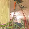
Hi! I am back again with the introduction to my next ride. It will be a mix between a regular B&M giga and a B&M looper. I think this will take me to the next step of building and I hope I enjoy this build as much as my last one.

The building is more complex, the structure is more conplex; the cross ties are closer and the build is more realistic. Here is my next, new coaster!

Attached File  20160302_225102.jpg   142.45KB   2 downloadsAttached File  20160302_224850.jpg   117.26KB   0 downloads
Attached File  20160302_225233.jpg   116.14KB   0 downloads
Attached File  20160302_224830.jpg   121.35KB   1 downloads
Attached File  20160302_225011.jpg   84.2KB   0 downloads

Attached Files


Edited by Mister Piglette, 22 August 2016 - 11:55 PM.


[SIGPIC][/SIGPIC]
Pigs are better when green.


#2 coasterdude1216

coasterdude1216

    Shoobie

  • 55 posts

Posted 03 March 2016 - 08:56 AM

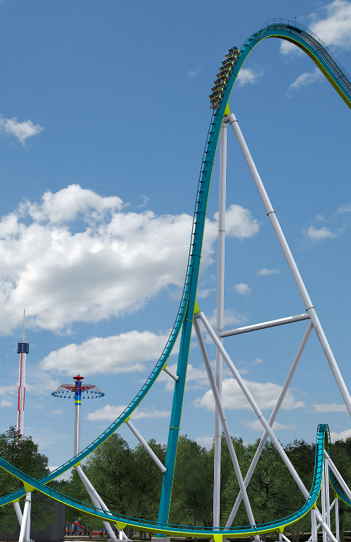
Nice start so far!  If this is a B&M giga I would suggest referring to an image such as this one for drop shaping:

Fury05_revised.png


B&M's standard mega/giga drop is a sharp radius crest at the top, transitioning into a much larger radius down the main length of the drop, and then a pretty short transition into the pullout.


Edited by coasterdude1216, 03 March 2016 - 10:25 AM.


1. X2 • 2. Iron Rattler • 3. El Toro • 4. Intimidator 305 • 5. Fury 325 • 6. Millennium Force • 7. Storm Runner • 8. Voyage • 9. Boulder Dash • 10. Twisted Colossus
Total Count: 192

#3 Mister Piglette

Mister Piglette

    Entry Engineer

  • 740 posts

Posted 03 March 2016 - 12:54 PM

Nice start so far! If this is a B&M giga I would suggest referring to an image such as this one for drop shaping:
Fury05_revised.png

B&M's standard mega/giga drop is a sharp radius crest at the top, transitioning into a much larger radius down the main length of the drop, and then a pretty short transition into the pullout.


I went with a regular B&M looper style drop (less steep) because it truly is going to be a looper, but I want to add in the sense of a giga, even though the drop isn't exactly giga-like.

[SIGPIC][/SIGPIC]
Pigs are better when green.


#4 Helmut

Helmut

    Das Beste oder Nichts

  • 3012 posts

Posted 03 March 2016 - 01:52 PM

Personally I really like the idea of combining features of B&M Giga coasters and Looping coasters. In general it can lead to very funky elements and lay-outs. However, it is incredibly hard to combine both features on the lifthill and drop. Although I understand your reasoning, the drop does simply not look steep enough. Of course it is up to you whether you want to change it or not, but I would recommend making the drop as steep as the drops on Giga coasters. Other than that, the lifthill and drop look great. The supports look solid and I like the catwalks!


Edited by Helmut, 03 March 2016 - 01:53 PM.


Posted Image


#5 coasterdude1216

coasterdude1216

    Shoobie

  • 55 posts

Posted 03 March 2016 - 02:48 PM

Well if you're gonna go with looper-style drops, I would still say make a bit of a modification. It looks much like an arrow hyper drop, (radius, straight, radius) right now.  Sorry to be critical about such a small detail but since it's already so good I say why not make it perfect  ;)


1. X2 • 2. Iron Rattler • 3. El Toro • 4. Intimidator 305 • 5. Fury 325 • 6. Millennium Force • 7. Storm Runner • 8. Voyage • 9. Boulder Dash • 10. Twisted Colossus
Total Count: 192

#6 BGTKing

BGTKing

    Administrator

  • 7516 posts

Posted 03 March 2016 - 02:57 PM

That is a great analogy Coasterdude. Classic look; just not a modern design.


#7 Coasterman345

Coasterman345

    Carp Diem

  • 610 posts

Posted 03 March 2016 - 05:18 PM

Looks pretty sick, I like it!


[SIGPIC]

Signature (Current)

[/SIGPIC]

“Reality continues to ruin my life.” ― Bill Watterson


#8 ~stεεlspectrum~

~stεεlspectrum~

    You ready to ride the Fist O' Pain?

  • 7526 posts

Posted 05 March 2016 - 06:23 PM

I'd have to agree with the others, I think that the drop could be changed to look more modern. If you don't want to make it steeper, you could at least make it more curvy (get rid of the straight spot) to look more like a modern B&M.


Your supports and catwalk look amazing, though. How stiff is the track on the drop with that backbone?


#9 Mister Piglette

Mister Piglette

    Entry Engineer

  • 740 posts

Posted 05 March 2016 - 07:53 PM

Personally I really like the idea of combining features of B&M Giga coasters and Looping coasters. In general it can lead to very funky elements and lay-outs. However, it is incredibly hard to combine both features on the lifthill and drop. Although I understand your reasoning, the drop does simply not look steep enough. Of course it is up to you whether you want to change it or not, but I would recommend making the drop as steep as the drops on Giga coasters. Other than that, the lifthill and drop look great. The supports look solid and I like the catwalks!


Well if you're gonna go with looper-style drops, I would still say make a bit of a modification. It looks much like an arrow hyper drop, (radius, straight, radius) right now.  Sorry to be critical about such a small detail but since it's already so good I say why not make it perfect  ;)


That is a great analogy Coasterdude. Classic look; just not a modern design.


Looks pretty sick, I like it!


I made the drop steeper, but now I feel like the crest is too round. Almost has an Intamin feel. I have one solution, which would be to make the pullout go all the way to the bottom, but I want you guys to see my first solution.

I'd have to agree with the others, I think that the drop could be changed to look more modern. If you don't want to make it steeper, you could at least make it more curvy (get rid of the straight spot) to look more like a modern B&M.
 
Your supports and catwalk look amazing, though. How stiff is the track on the drop with that backbone?


It makes the track pretty sturdy. I think it is better than layering up gray rods. I'll use the backbone for the first element also, depending on how I finish the drop.

Thanks guys for your comments on my catwalks too (:

Here is maybe one or two photos of what I adjusted it to:

Attached File  20160305_192441.jpg   111.24KB   0 downloads
Attached File  20160305_192411.jpg   130.04KB   0 downloads

Any other comments would be appreciated on what you think(:

[SIGPIC][/SIGPIC]
Pigs are better when green.


#10 +Timmeh+

+Timmeh+

    ranting somewhere about something

  • 890 posts

Posted 06 March 2016 - 12:01 AM

I really like this concept.

Cant wait to see the next element :D 


Sic Parvis Magna
TimmehTheAmazing


#11 TEDDSTER

TEDDSTER

    Polar Bear

  • 267 posts

Posted 06 March 2016 - 12:48 AM

I'm really enjoying this build. It looks good, but it looks like the pullout is a little sharp at the 45* area, though that could just be the image, or my eyes.

39797.png


#12 Mister Piglette

Mister Piglette

    Entry Engineer

  • 740 posts

Posted 11 March 2016 - 11:03 PM

I guess I had to change it one more time! Ugh!

Anyways, I lowered the drop once more and the ending result made it look much better, but made the crest appear too wide. I don't really know how to fix this but I'll show what I have now.

Attached File  20160310_210449.jpg   111.72KB   0 downloads
Attached File  20160310_210238.jpg   133.16KB   1 downloads

Just tell me if there's anything else I need to adjust (:

Edited by Mister Piglette, 11 March 2016 - 11:10 PM.


[SIGPIC][/SIGPIC]
Pigs are better when green.


#13 CW5X

CW5X

    Wha?

  • 3579 posts

Posted 13 March 2016 - 07:13 PM

I think the thing with this kind of crest is that it starts off pretty sharp and then gradually opens out. The drop itself looks a lot better than before but the track seems to jut out just after the wheel which is probably making the crest seem a lot wider. If that part was altered a little, I think that might at least improve the overall appearance. The drop angle is probably about where it needs to be anyway. It always a bit hard to judge. It might just be one of these things that's easier at a larger scale but keep at it and I'm sure you can perfect it.

Silverstar Nemesis Poseidon Air Saw The Swarm Nemesis Inferno Colossus ​RageThe Smiler Oblivion Shockwave GeForce Apocalypse Detonator Kumali Mumbo Jumbo Atlantica Supersplash Velocity Blue Fire Megacoaster Pepsi Max Big One Wodan


See No Limits and K'nex here


If only I had more space/pieces. Delete as appropriate

Tyndrum


#14 +Timmeh+

+Timmeh+

    ranting somewhere about something

  • 890 posts

Posted 15 March 2016 - 09:10 PM

I think people might be a little over-critical at this point. I think you should just move on to the next element and not worry too much about the drop.


Sic Parvis Magna
TimmehTheAmazing


#15 Mister Piglette

Mister Piglette

    Entry Engineer

  • 740 posts

Posted 10 April 2016 - 12:57 PM

I guess it's been a month, and that's really depressing for me because I hate losing motivation for building. I guess I just lost confidence having to redo everything and being critical about myself.

I took down the drop I had and tried to replace it and made the crest better. I hope it lives up to your expectations. I'm not completely done with it obviously, but I thought I should at least see if the crest is okay before I do any other things.

Attached File  1460310742772-968116700.jpg   143.58KB   1 downloads

That's all I am able to load. If someone could point out where my pullout should start, that would be nice. I don't want to mess it up the first time I tried.

Thanks, and please comment (:

[SIGPIC][/SIGPIC]
Pigs are better when green.


#16 CW5X

CW5X

    Wha?

  • 3579 posts

Posted 11 April 2016 - 04:43 AM

I think it looks a lot better now it's a bit smaller but I wouldn't be so critical on yourself. If worrying about little things is making it no fun then I wouldn't really worry about them. Just build how you want and update whenever you feel you need advice. As for the pullout, you probably want to start it a little under half way up. That's what I came out with when building Gargantuan and it seemed to work out fine even if at first it does appear rather small. Anywhere around that area really and it'll be fine if that's the look you want.

Silverstar Nemesis Poseidon Air Saw The Swarm Nemesis Inferno Colossus ​RageThe Smiler Oblivion Shockwave GeForce Apocalypse Detonator Kumali Mumbo Jumbo Atlantica Supersplash Velocity Blue Fire Megacoaster Pepsi Max Big One Wodan


See No Limits and K'nex here


If only I had more space/pieces. Delete as appropriate

Tyndrum


#17 rgarner42

rgarner42

    Construction Foreman

  • 203 posts

Posted 11 April 2016 - 02:42 PM

I agree. Its looking really good now. And yeah, a bit below half way down would be a good place to start the pullout, maybe somewhere around the 7 to 8th half moon down.  Get that done and then you can finally move onto the rest of the layout, I'm looking forward to it. :)

     (And maybe you could use grey rods instead of flexis. I don't know about anyone else but I often find them much easier to shape with, especially on reasonably large scale elements)


#18 Mister Piglette

Mister Piglette

    Entry Engineer

  • 740 posts

Posted 14 April 2016 - 10:53 PM

Well, I had just finished an update but when I tried to post it, the website deleted it so I will try again.

Anyways, thank you two for the comments and they were appreciated.

I have pictures for my update which will show my snake-bank (as I will can it) and an overview, I think. Here are the pictures:

Attached File  Snapchat-5003453040257571052.jpg   173.9KB   0 downloads
Here's my favorite picture.
Attached File  Snapchat-3749819121549998056.jpg   178.53KB   0 downloads
Here's one more.

Attached File  Snapchat-5715941369686250242.jpg   186.73KB   0 downloads
This view of the ride makes it look awful, but I can't do anything about it.

Okay, so that's all the pictures I have. I understand that there aren't any diagonals yet, but I'll get there to make it stronger.

If you would like to comment, go ahead, and thank you (:

[SIGPIC][/SIGPIC]
Pigs are better when green.


#19 Spaghetti

Spaghetti

    Golden State blew a 3-1 lead in the 2016 NBA Finals.

  • 786 posts

Posted 14 April 2016 - 10:56 PM

Dang, that's some sexy twists... I want more! :D


Edited by Spaghetti, 14 April 2016 - 10:56 PM.


banner_georgia_scorcher3_sfog_0.jpg?itok


#20 ~stεεlspectrum~

~stεεlspectrum~

    You ready to ride the Fist O' Pain?

  • 7526 posts

Posted 15 April 2016 - 02:10 PM

I personally love it. It's like a bigger version of one of Fastman XC's crazy elements.

 
c5853f4c4baa3572ba39607e4e16e7c8.jpg


Also tagged with one or more of these keywords: steel giga, piglette