Here's a hard job:
1) Logo for
Pompeii
2) Logo for Gladiator
3) Scrolls of the Aegean
Logo
4) Tribuchet Logo
That should keep you busy....
Pompeii Logos
Started by
Shamu
, Jan 29 2005 11:02 PM
14 replies to this topic
#1

Shamu
-

-

- 1439 posts
Lead Engineer
Posted 29 January 2005 - 11:02 PM

#2
Adam_Deux
-

-
- 2407 posts
Bi-Yearly Visits
Posted 29 January 2005 - 11:28 PM

Haha, there you go Shamu!


There's the newer one. . . I thought the gate/entrance way
thingy could be like the door to your park, you get? lol
Penn State University - Civil Engineering '11
#3
Dakanektr
-

-
- 3068 posts
SSC's Official DP Fanboy
Posted 30 January 2005 - 12:28 PM

Here's an attempt...not too good because I
don't really know what you want..
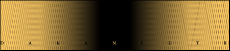
-matt-
#4
Shamu
-
-
- 1439 posts
Lead Engineer
Posted 30 January 2005 - 02:00 PM
Dak, logos are the signs. Don't you agree that
the words should be the biggest thing? I like yours TC. Especially the entry.
the words should be the biggest thing? I like yours TC. Especially the entry.
#5
Adam_Deux
-
-
- 2407 posts
Bi-Yearly Visits
Posted 30 January 2005 - 07:00 PM
You actually like them? 
I slapped them
together in some no-name Image maker. . haha, this is awesome!
I slapped them
together in some no-name Image maker. . haha, this is awesome!
Penn State University - Civil Engineering '11
#6
coastercrazy10
-

-
- 7008 posts
Mad Scientist
Posted 30 January 2005 - 08:38 PM
i wish i could see them...USE
PHOTOBUCKET! IT'S SO MUCH BETTER THAN ANY OTHER
ONE!! WHOAAAA!...
Never happened, no?
i may try to get you some logo's shamu
crazy

PHOTOBUCKET! IT'S SO MUCH BETTER THAN ANY OTHER
ONE!! WHOAAAA!...
Never happened, no?
i may try to get you some logo's shamu
crazy
SSCoasters Staff | The SSCoasters Forum Rules
University of Illinois at Urbana Champaign | Computer Science & Mathematics
Fireball | Kingda Ka | Inclination | Diamondback
#7
Adam_Deux
-
-
- 2407 posts
Bi-Yearly Visits
Posted 30 January 2005 - 08:53 PM
Bleh, you have to sign up for photoshop. . .I'd
rather not.
rather not.
Penn State University - Civil Engineering '11


#9
Shamu
-
-
- 1439 posts
Lead Engineer
Posted 31 January 2005 - 07:13 PM
Yours is a good logo T2 (Gladiator), but add a little
more to it. I am using Adam's Pompeii logo for now. Can't wait till CC10
takes a stab at it!
more to it. I am using Adam's Pompeii logo for now. Can't wait till CC10
takes a stab at it!
#10
coastercrazy10
-
-
- 7008 posts
Mad Scientist
Posted 31 January 2005 - 07:24 PM

I tried to make the text simple, so as not
to draw too much attention from the architecture
crazy
SSCoasters Staff | The SSCoasters Forum Rules
University of Illinois at Urbana Champaign | Computer Science & Mathematics
Fireball | Kingda Ka | Inclination | Diamondback
#11
Shamu
-
-
- 1439 posts
Lead Engineer
Posted 31 January 2005 - 08:00 PM
That text is way too modern. Sorry.
#12
coastercrazy10
-
-
- 7008 posts
Mad Scientist
Posted 31 January 2005 - 08:07 PM
tried to make it a bit less modern

the outline is there so its easier to read
the text. I tried to make it look crumpled like an old scroll
crazy
the outline is there so its easier to read
the text. I tried to make it look crumpled like an old scroll
crazy
SSCoasters Staff | The SSCoasters Forum Rules
University of Illinois at Urbana Champaign | Computer Science & Mathematics
Fireball | Kingda Ka | Inclination | Diamondback
#13
Dakanektr
-
-
- 3068 posts
SSC's Official DP Fanboy
Posted 31 January 2005 - 08:56 PM

No that is not porn in the background. It is an ancient
encasement body of a real Pompeiian covered with Volcano crap.

Here is my redesigned Gladiator logo
I took an ancient painting of a gladiator that looked kinda "rusty"
[img]http://img.photobucket.com/albums/v481/Dakanektr/94fa3afe.jpg'
border='0' alt='user posted image' />
Fixed the redesigned logo so you see both
gladiators. What do you think?
-matt-
#14
Adam_Deux
-
-
- 2407 posts
Bi-Yearly Visits
Posted 01 February 2005 - 02:56 PM
lol. . . what have I done? I've started a
trend!
Shamu. . . do you think the "Pompeii" in my logo would look better right
over the entrance?
trend!
Shamu. . . do you think the "Pompeii" in my logo would look better right
over the entrance?
Penn State University - Civil Engineering '11
#15
Shamu
-
-
- 1439 posts
Lead Engineer
Posted 01 February 2005 - 06:46 PM
No, I don't.


