
19 replies to this topic
#1

knex-man
-
-

- 573 posts
Dutch Details employee
Posted 09 September 2010 - 03:47 PM
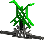
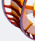
After building Moloch for the exposition in Oosterhout I decided to build another rollercoaster. It is going to be a B&M Mega Coaster. There are no plans for the layout yet.
#2
Jumpge
-

-

- 3930 posts
Stopping by every now and then!
Posted 09 September 2010 - 04:29 PM
Pretty nice! There are a few things wrong though...
One, the crest of the lift looks a little sharp. Make it like your Dominator's crest and it will look good.
Two, The pullout looks a little small.
And three, i think that the drop has a sharp spot.
You don't have to listen to a builder like me about the last two thing if you don't want to, but the first one should be a definite.
#3
Jogumpie
-
-

- 13586 posts
Living through the great Gump hiatus...
Posted 09 September 2010 - 05:00 PM
I'd have to say this is looking very good. Not sure about the position of the gear, though. Have you used one or two gears? Running the chain over one single gear reduces speed loss when the train rolls past it.
SSCoasters Administrator
The SSCoasters Forum Rules


#4
rollercoasterfanatic919
-
-

- 3357 posts
Switch 360!
Posted 09 September 2010 - 05:05 PM
The crest and drop looks great, just like a B&M. I might start the pullout half a granite or a bit more higher though, it looks a little bit tight. Good job though!


MF | Toro | TTD | Maverick | Ka | Griffon | Nitro | Storm Runner | Skyrush | Phoenix
#5
~stεεlspectrum~
-
-
- 7526 posts
You ready to ride the Fist O' Pain?
Posted 09 September 2010 - 08:14 PM
I'd have to say this is looking very good. Not sure about the position of the gear, though. Have you used one or two gears? Running the chain over one single gear reduces speed loss when the train rolls past it.
Oh, I had always wondered why you only used one gear. That's a nice idea.
The pullout does look a tad small...
#6
Antinos
-
-
- 8086 posts
Is it smooth and long?
#7
knex-man
-
-
- 573 posts
Dutch Details employee
Posted 14 September 2010 - 12:52 PM
Thanks for your comments!
I´ve got a little update:


Please tell me whether the shaping is right, so I can start adding a lot of supports to the pull out (it will really need them).
I´ve got a little update:
Please tell me whether the shaping is right, so I can start adding a lot of supports to the pull out (it will really need them).
#8
rsteele06711
-

- 323 posts
Go Bulls!
Posted 14 September 2010 - 02:57 PM
I love the shaping dude! Here is a no-gear solution that I recently invented. (Can I patent it?)
Blurriez!!!


Blurriez!!!

RK500
[SIGPIC][/SIGPIC]
Thanks Spitfire!
#9
knex-man
-
-
- 573 posts
Dutch Details employee
Posted 19 September 2010 - 01:11 PM
I love the shaping dude! Here is a no-gear solution that I recently invented. (Can I patent it?)
Thanks! That is indeed a good no-gear solution, but I have seen it before.
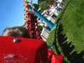
I have an update, the camelback is 4/7 done, hope you like it!


#10
maarten12
-

-
- 2917 posts
Medium-Gump
Posted 19 September 2010 - 01:32 PM
wow, that's some pure awesomeness. I really like to see you're building again! Keep it up 
#11
Blackkitty
-
-
- 1705 posts
Meow!
Posted 19 September 2010 - 01:53 PM
I think that the hill is a little too straight for my liking.
[SIGPIC][/SIGPIC]
#12
RCExtreme
-
-
- 851 posts
Entry Engineer
Posted 19 September 2010 - 03:49 PM
Everything looks good except the crest of the hill. Maybe lower the top of the crest slightly to make it less sharp.
#13
TheSUCKCrew
-

-
- 4095 posts
Way too old
Posted 19 September 2010 - 04:19 PM
Yeah, that camelback looks a bit staight...
Also what ^ said, fix the crest.
-Suck.
Also what ^ said, fix the crest.
-Suck.
#14
Maverix
-

-
- 2281 posts
Aieght
Posted 19 September 2010 - 09:02 PM
That is about as perfect a B&M camel-back hill as you're going to get. Good job
[SIGPIC][/SIGPIC]
Top 10 Coasters:
1. Intimidator 305 2. Maverick 3. Storm Runner 4. Millennium Force 5. Gatekeeper
6. Diamondback 7. Manta 8. Wild Eagle 9. Thunderhead 10. Apollos Chariot
#15
Sniggeh
-

-
- 1511 posts
Lead Engineer
Posted 20 September 2010 - 07:58 AM
It's looking nearly perfect. All I can point out is that there are a couple of minor bumps in the camelback's crest. Great job and keep it up.
.
#16
Millcreek47
-

- 1186 posts
BANNED
Posted 20 September 2010 - 07:23 PM
Everything looks good except the crest of the hill. Maybe lower the top of the crest slightly to make it less sharp.
Yeah, that camelback looks a bit staight...
Also what ^ said, fix the crest.
-Suck.
The crest of b&m camelbacks are what make b&m coasters amazing... That sharp spot gives it that pop of airtime.
Spectacular hill knexman! Keep it up. You're inspiring my next project!

(Sig under construction)
-----XBL Gamertag - I were Speshul-----
Top 5: Time Machine, The Incredible Hulk, Goliath, Dueling Dragons, Georgia Scorcher
#17
knex-man
-
-
- 573 posts
Dutch Details employee
Posted 04 October 2010 - 08:16 AM
Thank you for the comments! I really appreciate them.
I changed the hill a little bit, the pull in is now a little bit bigger, to make it look less straight. I also added more supports and made the crest smoother (it's still got that little pop though)


I changed the hill a little bit, the pull in is now a little bit bigger, to make it look less straight. I also added more supports and made the crest smoother (it's still got that little pop though
)
#18
Jogumpie
-
-
- 13586 posts
Living through the great Gump hiatus...
Posted 04 October 2010 - 11:01 AM
Looking delicious. You are currently building in parts until the garage can be used as construction site again?
SSCoasters Administrator
The SSCoasters Forum Rules
#19
Jumpge
-
-
- 3930 posts
Stopping by every now and then!
Posted 04 October 2010 - 06:34 PM
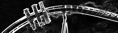
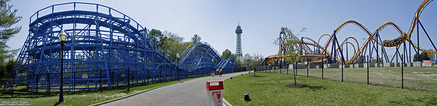
I like it but i think that its a little to straight still. I think you should make the hill more like This. Use the hill in the background for a reference. I think it would look better IMO. As soon as i posted that and looked at the pic and compared them, i realized that they are the same! LOL! Just make it look a little more like this then. It doesn't have to be a higher hill but a little more rounded at the top and more of a pull up. Just use that pic please.
#20
dk36870
-
-

- 80 posts
Construction Worker
Posted 04 October 2010 - 07:27 PM
Looking Great, though if your supports get weak on that drop,
you could put box supports from middle of drop to support column holding up lift hill.
Just a suggestion from a Micro Creator:tmbs
you could put box supports from middle of drop to support column holding up lift hill.
Just a suggestion from a Micro Creator:tmbs


