To me everything looks good. A name suggestion could be 'Virtual Energy'.
Thanks!
I could go with that.

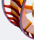
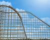
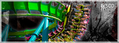
Fine, use more crossties. It just doesn't look good IMO without more. And it doesn't seem to flow.
I build my coasters, then with the left over x ties I add them in spots that need them.
Name: Rigel (I used this, but I canceled it, so you could use that)
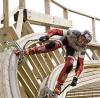
funny, the thing after the camelback looks a lot like sirchub's blitzen. I think it looks nice so far! Keep up the good work!
-cf11 :cool:
Lol, your right!
Thanks.
IMO, the overbank should be a bit longer. drop is not very smooth, fix that. everything else looks pretty good, im liking this coaster.
Il fix the bumps but I want to keep the over bank.
good
i like it
Thanks.
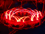
The first pic. makes the top of the overbank look sharp.
Il fix that by the next update.